Polaris Platform
UI/UX Work for Synopsys
Background
Defining the Problem
Polaris is a security product that helps users find vulnerabilities in their code. The product was compiled of several features from multiple security products within the Software Integrity Group rolled up into one to create a quality experience. The challenges we faced were with integrating these features to be consistent throughout Polaris.
During my time on Polaris I worked on several key features that enhanced the usability of the product and tied in other existing product features that helped shape polaris into the ultimate toolkit for users as well as contributed to new component patterns to our design system library.
Below are examples of my time on Polaris and it’s journey through an updated design system and integration of features.
UX Flows
Many use cases needed flow diagrams to illustrate the process and which elements the UI was using for the engineers to know what to build. Similar to storyboarding except focusing on one user story. Here are some examples of workflows that were updated to be a simpler experience. This process helps engineering understand the design as well.

A wireframe workflow example of logging in with a CIAM.

A wireframe workflow showing how a user can get to the scan dashboard.
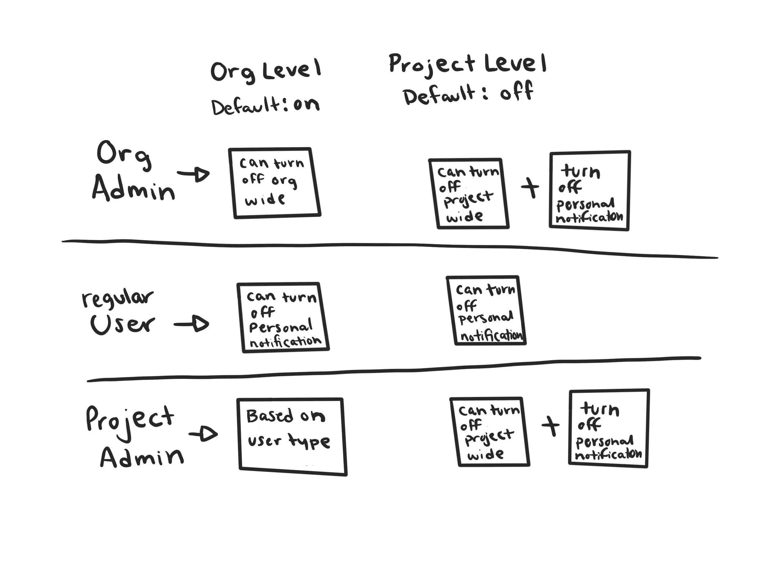
Distinguishing different permissions given depending on the role of the user.
New Design System
As part of the merging of features, we also aligned our designs with an update to our design system built in Figma for consistent use across the team. In this design update, we simplified the navigation to make more room for data on the pages. We also added other application types by adding in a sub horizontal menu. We kept the same color scheme for familiarity for our existing customers.


On the left is the old layout, with clunky navigation and not enough data. On the right, the new layout using the new design system.
New User Tour

User Story:
As a new user (or returning user that is new to the updated interface), I am unsure of what to do first after accepting the end user license agreement.
Potential Solution:
As part of the future enhancements to the new design system, turning the landing page into a welcome screen. It would have a popup that gives the user steps for tasks to complete first as a new user.
Features:
Able to skip tour for users who are either don’t need the tour
Have multiple steps to cover most foundational new user tasks
Once the user has been onboarded and no longer needs the walk-through, the homepage turns into a dashboard for their go-to needs.
Media: Figma
Notification Center
User Story:
As a user, I would like to receive notifications within the product so I can see important messages.
Potential Solution:
Another future improvement, a persistent icon that notifies the user about notifications, where they can see a dropdown of the most recent notifications, as well as the ability to navigate them to the notification center where the user can see all of their notifications. This was an opportunity to match the pattern to the new design system.
Features:
The icon is present in the top right corner near their account information so it is always present no matter where they are in the product.
Instant notification while in app.
Ability to manage and delete their notifications, and set notification settings.
Media: Hand Drawings, Figma

Sketch drawings of preliminary ideation.


Asset file of individual elements of the notification center UI, including fonts, icons, colors and variations.

Notification Bell icon in the top right corner, showing no new notifications.

The notification bell drop down menu showing multiple messages.

The notification menu showing no new messages.

Example of the welcome banner.

Example of the critical banner.

The help page with additional information on critical banner messages and other non-urgent messages.
Pattern Designs
Flash Message
Problem definition: As a user, they were unable to tell when an action was completed, and if it was successful or not. I designed this flash message to help users understand the process of the action and whether or not they need to take any further action.
Media: Procreate, Sketch, Adobe Photoshop


Open Issue Counter Donut
Problem Definition: I created this component to help users identify how much of their project had open issues, they needed a quick reference visual that aids them in seeing their issues as a color scale representing their severity level.
Media: Procreate, Sketch, Adobe Photoshop


New workflows
Onboarding using Software Change Management (SCM)
Problem Definition: This project I helped introduce consistent design patterns and ease of use. SCM integration was vital for larger customers as it helped streamline their onboarding experience. I helped work on the storyboarding with stakeholders, and built the entire workflow in figma with high fidelity mockups.
Simplified Policy Configuration
Problem Definition: Previously policy configuration was clunky and didn’t include room to streamline policies to multiple applications and only allowed users to select from a searchable list. My role was to help the user narrow their search down faster by applications, I helped with storyboarding with stakeholders and built the high fidelity mockups in Figma.